
Eos: A Holistic Menstrual Tracking App
PROBLEM
Despite the vital nature of the menstrual cycle, discussions surrounding the matter remain taboo. From a young age people who menstruate are conditioned to think that their cycle is a burden that needs to be dealt with. THIS DIALOGUE NEEDS TO CHANGE!
Although half of the population menstruates, there is a lack of education on the hormonal fluctuations and physiological changes that occur throughout the monthly infradian rhythm (or menstrual cycle). Hormonal imbalances and menstrual disorders are at an all time high! People who menstruate need to be empowered to holistically support their body’s natural rhythms.
SOLUTION
A holistic menstrual tracking app that provides users with the tools to optimize their health, manage their symptoms & align with the phases of their cycle.
Overview
ROLE UX /UI Designer
REQUIREMENTS Developing an end to end app
TIMELINE Approximately 80 hours
TOOLS: Figma, Whimsical, Miro, Useberry, Zoom
-

EMPATHIZE
Industry Research
Competitive Analysis
1:1 User Interviews
Affinity Map
-

DEFINE
Persona
Empathy Map
User Journey Map
Brainstorm
-

IDEATE
Sitemap
Task & User Flows
Wireframes
Branding & UI Kit
-

PROTOTYPE & TEST
High fidelity Prototype
Useberry Usability Test
Affinity Map
Priority Iterations

Understanding the industry and users’ current pain points
To kick off the design process, I conducted topic research, a competitive analysis and user interviews. By understanding the industry and users’ pain points, I gained clarity on the gaps in the market and potential ways to provide an exceptional user experience.
Topic Research
Uncovering the root cause of hormonal health disparities
Menstrual disorders are on the rise! People who menstruate are disproportionately affected by hormonal imbalances.
(Currently, 47% of women compared to 10% of men suffer from hormonal imbalance). This is largely due to two factors.
Competitive Analysis
Gaining clarity on gaps in the market
I investigated several relevant apps in the industry. I honed my focus on four products with either the most downloads, unique features, or engaging UI. I conducted an in-depth competitive analysis of Clue, MyFlo, Flo, and Apple Health. The app most related with the vision of Eos was MyFlo. MyFlo provides users with some education on how to adapt the phases of the menstrual cycle; however, content is minimal and personalized courses are behind a heavy paywall. While each app had its own strengths and weaknesses, Eos had an opportunity to provide a cut above the rest user experience.

User Interviews
What do users have to say?
To gain more insight into users' current experiences and pain points, I conducted 1:1 interviews with 4 participants. Each participant used menstrual tracking apps (Clue, Flo, Apple Health & P Tracker ) and expressed interest in holistic health and wellness. Based on the patterns and insights observed, I created an affinity map and grouped notes based on pain points & prominent themes.

The problem? People who menstruate are lacking the tools to align with their infradian rhythm.
Users feel like they were not given the education to take ownership of their cycle and hormonal fluctuations. Users want to know the WHY behind their body’s shifts and gain insight on how to holistically support the phases of their cycle. So, how do I design an experience that will empower users to align with their infradian rhythm? To gain a deeper understanding of users’ pain points and potential solutions, I created a persona, empathy map, and user journey map.
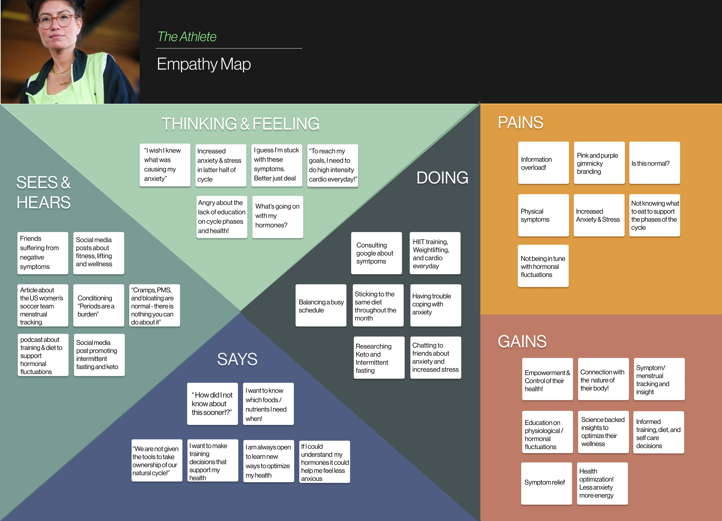
Eos Personas & Empathy Map
I created 3 personas and an empathy map that encompassed the data collected in the user interviews and secondary research. This helped to guide my decision making process throughout the duration of the project.


Eos Emotional Journey Maps
Following the personas & empathy map, I continued my topic research and created a phases of the infradian rhythm mind map. This information served as a guide for the user journey maps.
The first user journey map follows the persona Evelyn’s experience throughout her cycle before she begins to use Eos.This helped to define a user’s potential pain points and symptoms. The second user journey map follows Evelyn’s journey through a monthly cycle with the support of Eos. This helped to define potential opportunities and key features to include in the product.


HOW MIGHT WE….
PROBLEM STATEMENT
“ As an Eos user, I want to feel empowered and in tune with my body’s natural fluctuations. I want to understand my infradian rhythm and learn tangible, holistic ways to support my health through the phases of my cycle.”

Developing Eos with a mission to empower users in their health and self-care journeys
Inspired by the HOW MIGHT WE questions and PROBLEM STATEMENT the building blocks of Eos were created. To ensure a smooth user experience and gain clarity on the essential screens necessary for the MVP, I created a site map, task flows & users flows in Whimsical.
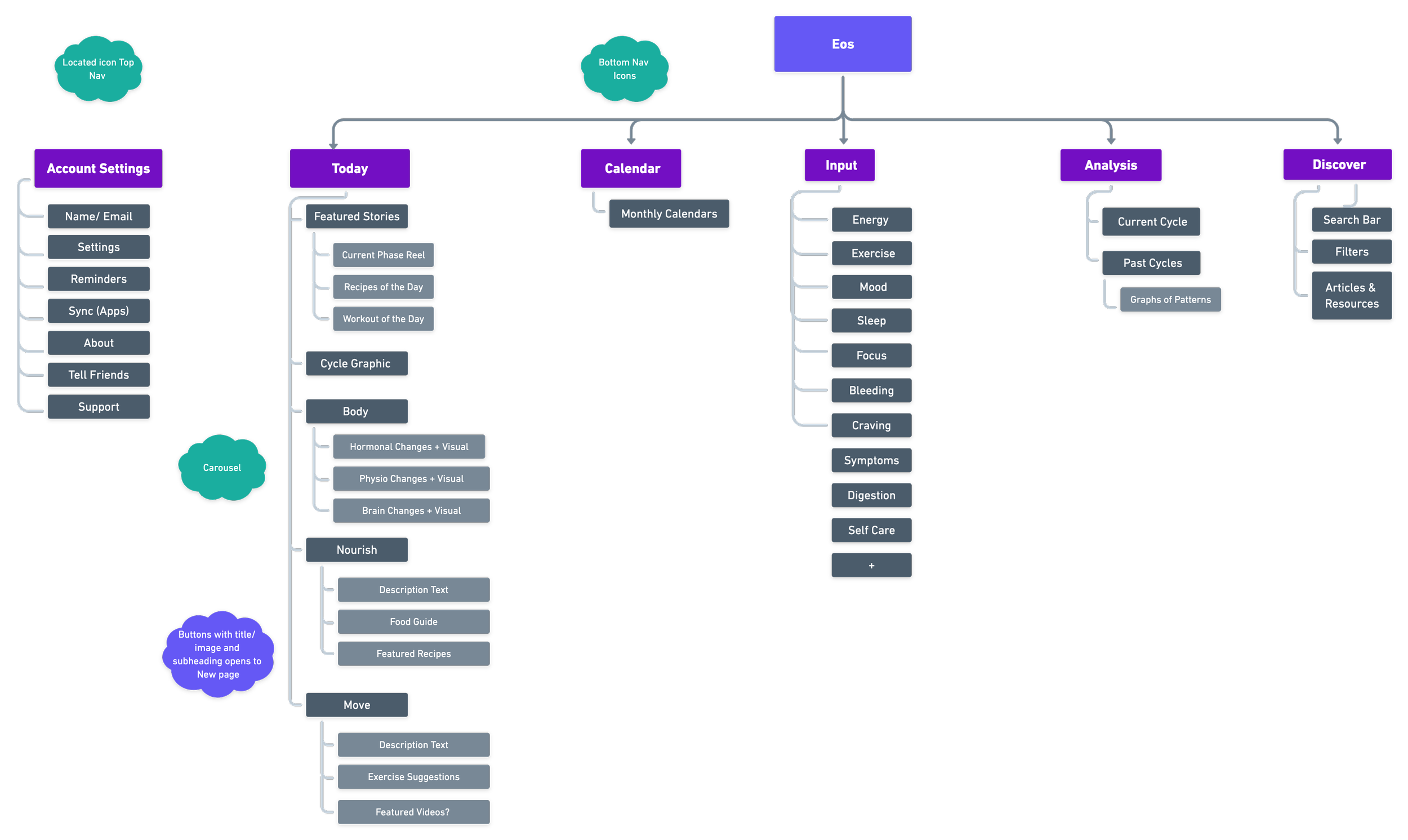

Building EOS’s skeleton
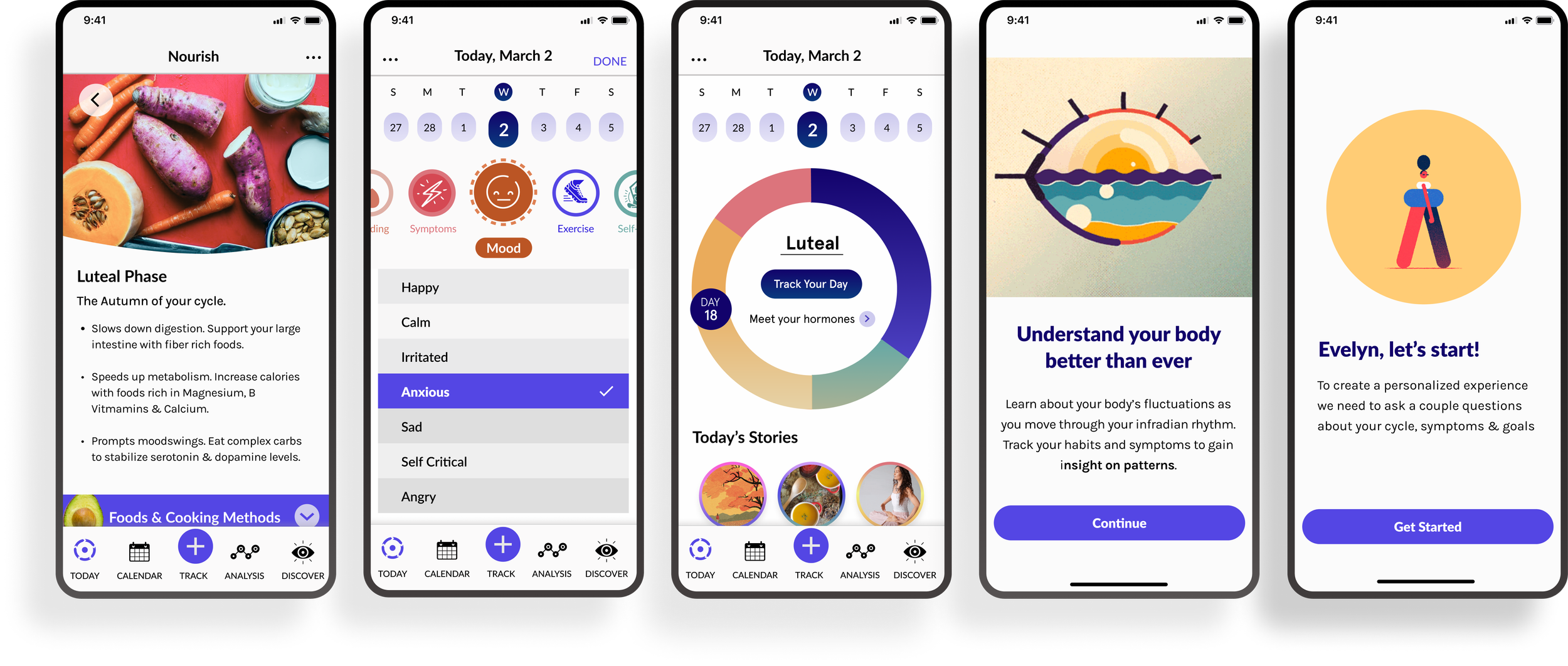
With the MVP screens mapped out in the task flows and user flow, the next steps were researching design patterns, sketching and developing the low-fi wireframes. The wireframes were designed centered on the following user tasks:
Signing Up for EOS
Onboarding as a new user
Learning about current hormonal fluctuations
Watching “Today’s Stories”
Learning tangible ways to support to the current cycle phase with food and exercise
Tracking daily symptoms and activities
Analyzing a pattern across logged cycles
Locating a symptom related article in the DISCOVER page
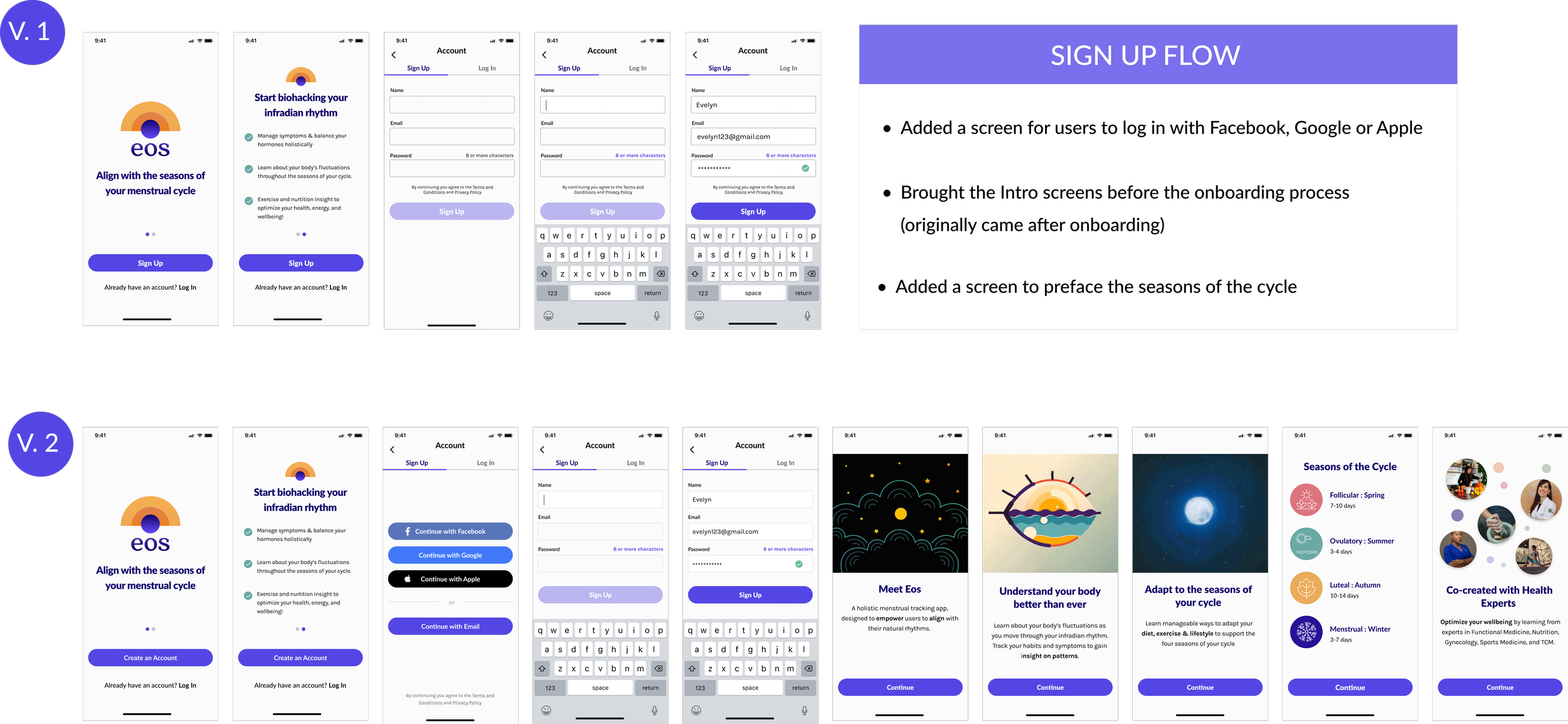
Bringing Eos to life
With the foundations established a mood board, logo, UI kit and hi-fi mockups were developed. Based on the user interviews, the goal was to stay clear of gimmicky pink and purple branding and create a product that was friendly, fun, and engaging. I began the process by finding aesthetic inspiration on Pinterest, Dribble & Behance. Next, I created a logo and UI Kit, which included Eos’s text styles, color palette, components, buttons, cards & progress trackers. Once Eos’s brand was established, the low-fidelity wireframes were developed into high-fidelity mockups.


Time to test - listening to the users’ two cents
I prototyped using Figma and conducted unmoderated usability tests with Useberry. Participants were given the opportunity to rate various tasks and provide anonymous feedback. The usability tests provided invaluable insight on Eos’s strengths and guidance on which areas to focus on in the priority iterations.
Usability Test Plan & Strategy
With Eos’s initial prototype ready for testing, I created a usability test plan and recruited 10 participants for an unmoderated test via Useberry. The usability test consisted of a 5 second scan, 8 tasks, and follow up questions.

4 out of the 10 users included the participants from the original user interviews. Despite two users reporting a couple broken links, the test went smoothly. Overall, I received positive feedback, and 10/10 users reported they would recommend the app to a friend!

Usability Test Insights
Following the usability tests, I made an affinity map to organize the feedback & results. This helped to define successes, pain points, and areas to focus on for priority iterations.

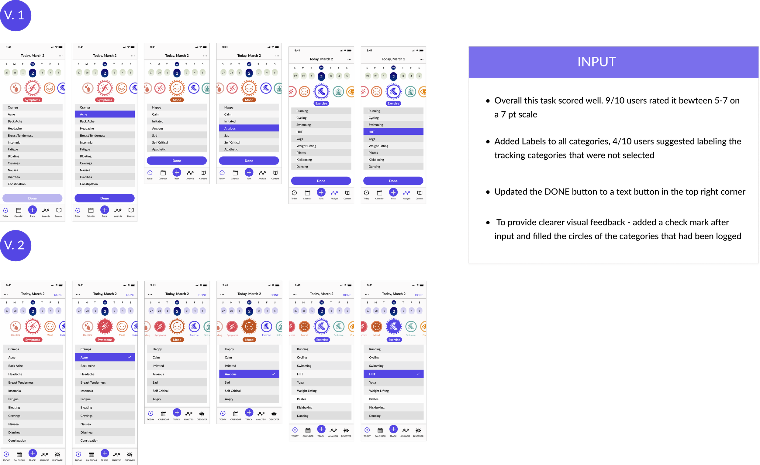
PRIORITY ITERATIONS


Conclusion
Thanks for scrolling! This project was a great opportunity to learn the ropes of developing an end to end product. Choosing a health related subject, I found that in depth topic research was essential for building Eos’s value and providing a unique user experience. I really enjoyed investigating design patterns, ideating on solutions and bringing the wireframes to life with Eos’s branding. Most importantly, Eos was built on the needs and pain points of users. Listening to user’s stories & iterating based on usability test feedback were essential tools for Eos’s success!
For the next steps, I would continue to explore ways to visualize data and the user’s tracked patterns.
