Bet X Legacy Design System
Revolutionizing the user-facing web portal of Bet X through the integration of a comprehensive design system, responsive components, and a dark mode color library, to deliver an enhanced user experience and operational efficiency.
Role
UX/UI Design, Design System Management, Accessibility Design
Tools & Resources
Figma, The Designership Figma Masterclass, Moonlearning Figma Auto Layout, Constraints & Breakpoints, Google Material Design Best Practices.
Problem
Bet X, a leading cashless payment service for online gaming, sports betting, and casinos, faced a significant challenge when I joined their team. The user-facing portal lacked a cohesive design system, resulting in inconsistencies, responsiveness issues, and a disjointed user experience. As a result, the handoff to the development team was suffering, leading to delays, discrepancies, and suboptimal user experiences.
My role was to create a comprehensive design system that would alleviate these challenges and lay the foundation for a more user-centered and efficient design and development process.
Note: I redesigned, restyled, and rebranded this project in Figma. The original version was built in Adobe XD. Additionally, the names, details, and data have been altered to comply with Non-Disclosure Agreement (NDA) requirements.
Goals
Establish a design system for the Bet X portal.
Create responsive design components to ensure consistency across multiple screen sizes.
Introduce a dark mode color and component library for improved user experience.
Streamline collaboration between designers and developers during the handoff process.
Lack of a Cohesive Design System
Discrepancies & Inconsistencies
Responsive Issues
Disjointed User Experience
Suffering Handoff to Dev Team
Research & Analysis
The research process commenced with a comprehensive analysis, addressing the portal's design challenges. Insights from sources including Google's Material Design principles and Web Content Accessibility Guidelines (WCAG) informed this initial exploration.
Key issues emerged, encompassing inaccessible color combinations on buttons, inconsistent font usage, small fonts, a lack of consistent grid system, and erratic color application - resulting in a disjointed user experience.
Following the analysis of these pain points, an examination of industry best practices for design systems and responsive design was conducted. This exploration was influenced by The Designership’s Figma Masterclass and Moonlearning's Figma Auto Layout, Constraints & Breakpoints course, guiding the strategy toward effective solutions and informed decisions.
The Atoms: Building from the Ground Up
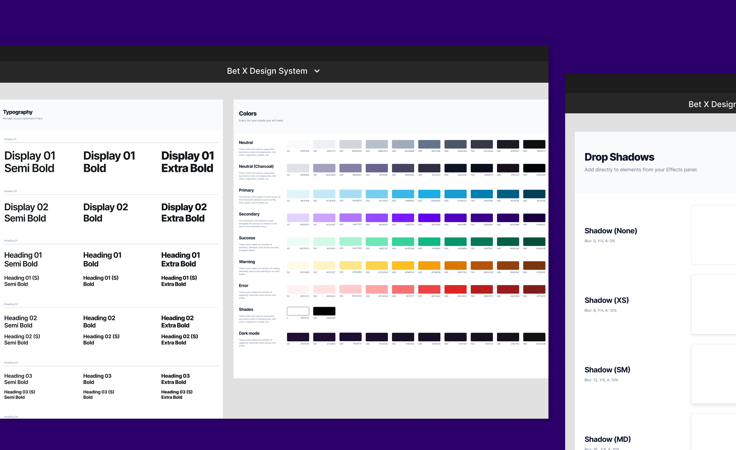
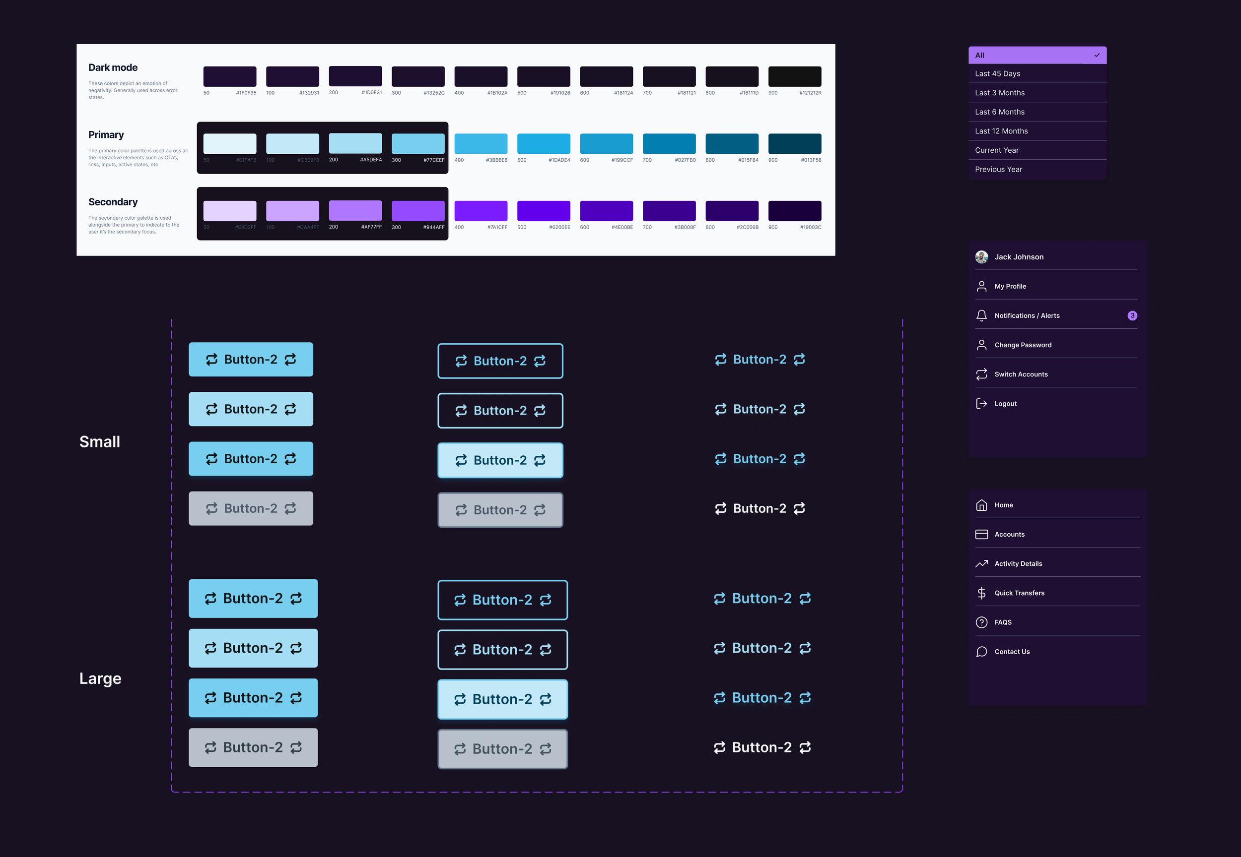
The foundation of the design system was established through the atomic design methodology. A color palette was crafted, encompassing a range of tints and shades for the brand's colors, neutrals, and dark mode variants.
This approach extended to the creation of a responsive typography scale, grids, icons, and drop shadows. These elements were added as styles within Bet X's Design System Figma library, fostering a unified design language across teams and ensuring consistency.
Color Accessibility
In the pursuit of designing an inclusive user experience, color accessibility played a significant role within Bet X's design system. Color contrast assessments were conducted for various color combinations, leveraging tools such as the Figma’s A11y plugin and the Accessible Color Matrix. These steps ensured that our color choices complied with the Web Content Accessibility Guidelines (WCAG) best practices.
The integration of the Accessible Color Matrix tool brought a unique advantage, allowing us to test an array of color schemes rather than just two at a time.
Responsive Grids & Breakpoints
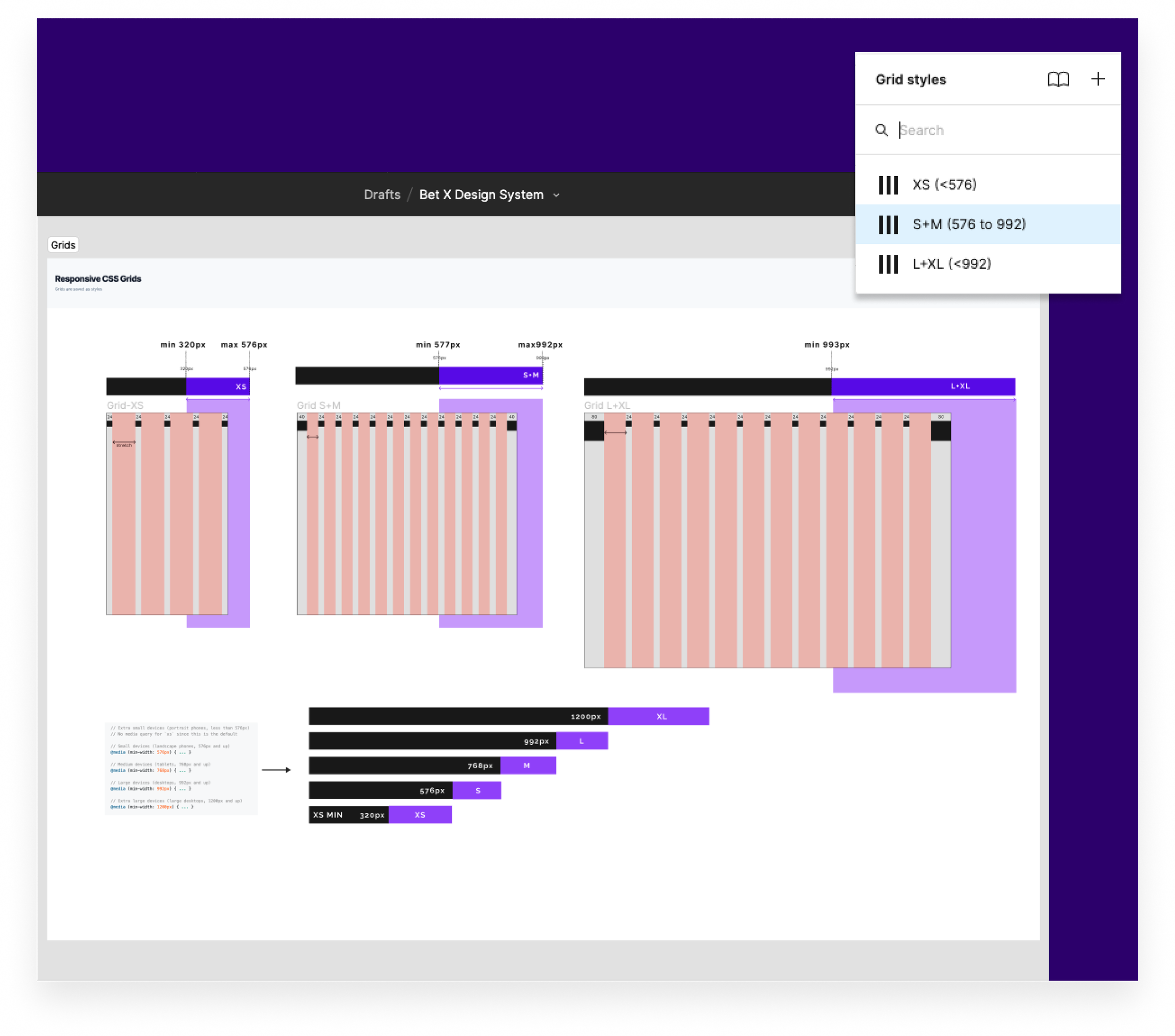
The implementation of responsive grids was essential in optimizing the user experience across varying screen sizes. Adhering to CSS standards, three distinct grid styles were established for different breakpoints: XS (min 320 px - max 576 px), S + M (min 577px - max 992 px), and L + XL (min 992 px and above).
This ensured that the portal's layout seamlessly adapted, delivering consistent and user-friendly interactions regardless of the device users accessed the platform from.
The Molecules: Developing Fundamental Elements
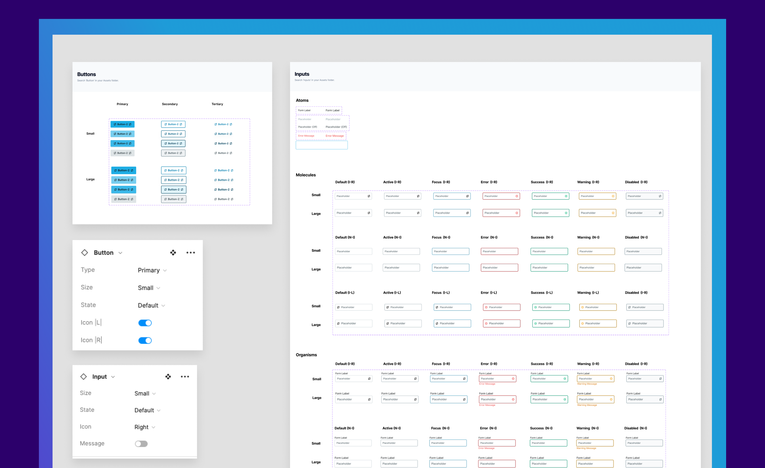
Continuing from the foundational atomic elements, the process advanced to molecule-level components such as buttons and input fields - forming the essential building blocks of Bet X's portal. Various button and form field states were created using variants and booleans, further enhancing the interactive nature of the interface.
Naming Convention
Establishing a clear naming convention for the components and their variants was vital for fostering efficient collaboration and streamlined development within the design system. A well-defined naming structure ensured consistency, simplified communication, and enabled teams to swiftly identify and utilize the required elements, promoting a cohesive and organized design process.
The Organisms: Building a Scalable Component Library
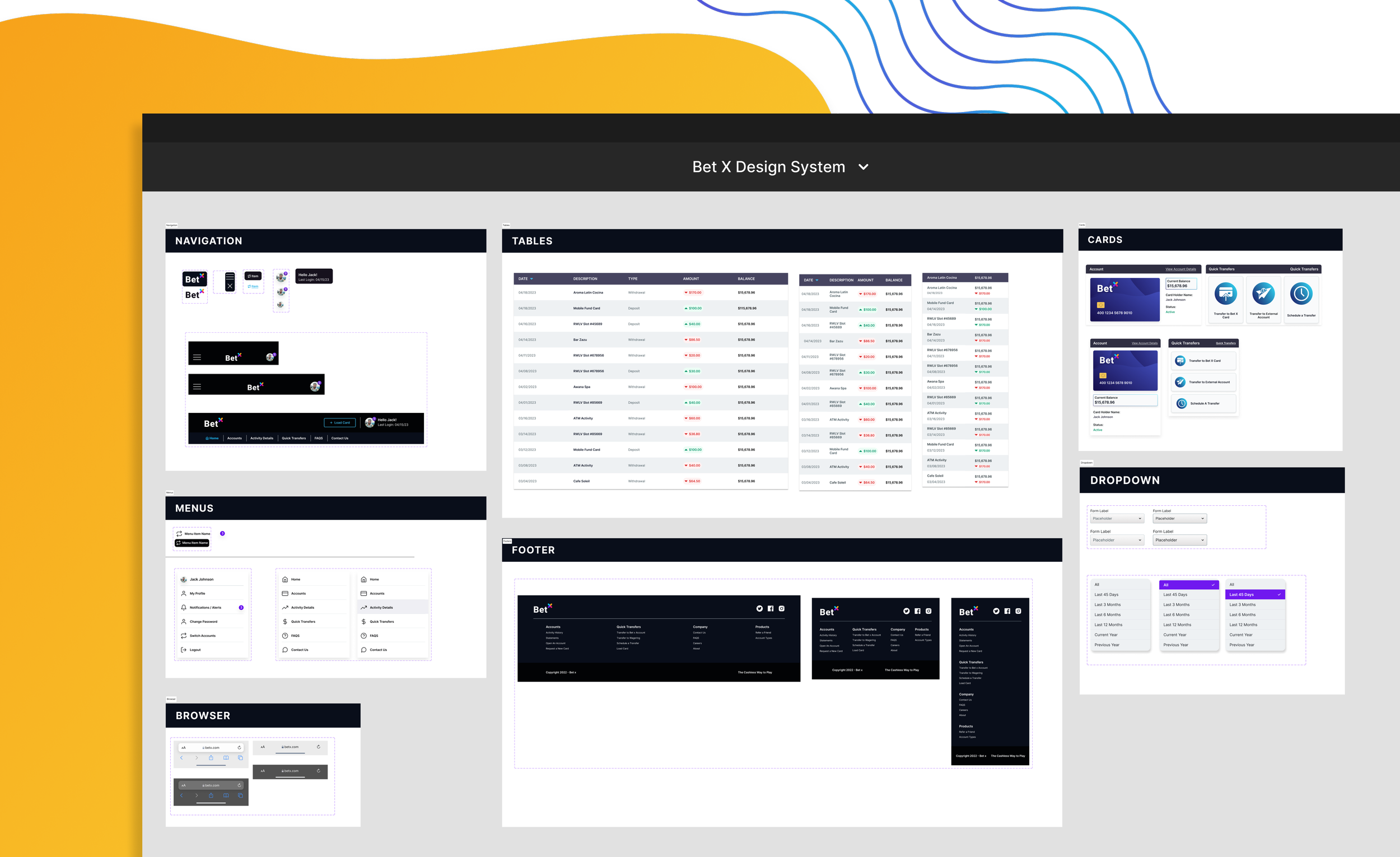
By harnessing the power of atomic elements and molecules, the design process advanced into the creation of responsive components, facilitated using auto layout and the box model. Initial components included navigation menus, footers, interactive menus, cards, and an activity history table.
It's important to highlight that this marks a foundational phase, setting the stage for the team to expand and develop additional components to cater to evolving product needs. Variants of these components thoughtfully adapt to accommodate the designated breakpoints, ensuring a seamless and cohesive user experience across varying screen sizes.
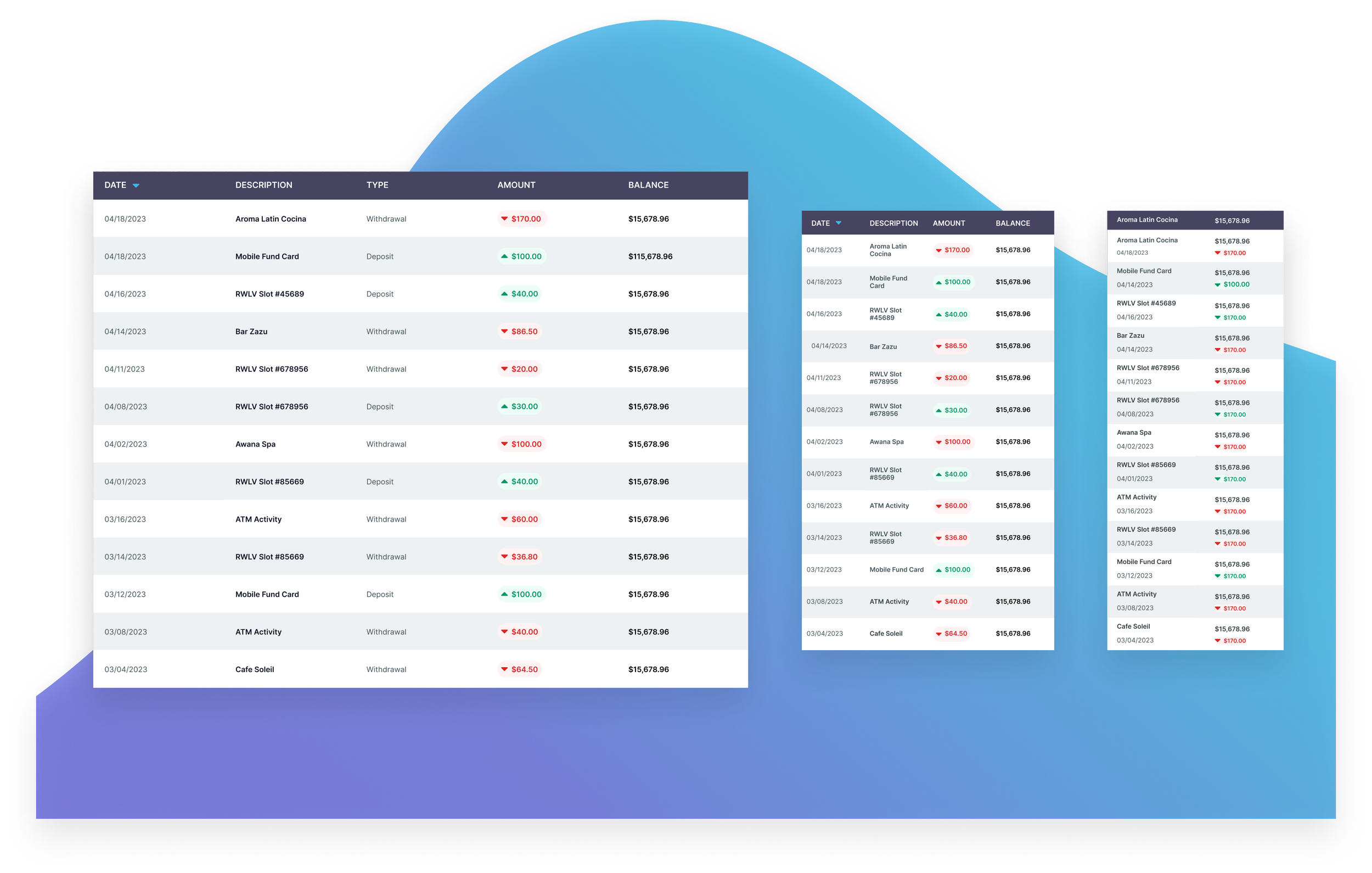
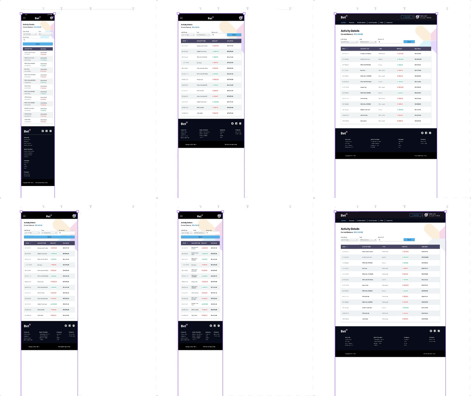
One notable challenge arose during this phase: scaling the activity history table for smaller screen sizes. To address this, I condensed the five columns of data into two categories for the mobile breakpoint. This entailed merging date and description into one column and incorporating running balance and withdrawal/deposit details into the second.
In adapting the component for the smaller breakpoints (XS and S + M), transaction type information was omitted. However, the user's ability to deduce this information was maintained through intuitive cues such as the amount displayed, directional arrows (up and down), and the use of color coding (green and red). This ensured that even within constrained screen sizes, users could effortlessly comprehend their transaction history, enhancing overall usability and retaining essential functionality.
Grid Testing
Each variant was thoroughly tested to ensure the components would optimally adapt across different screen sizes.
Responsive High Fidelity Mockups
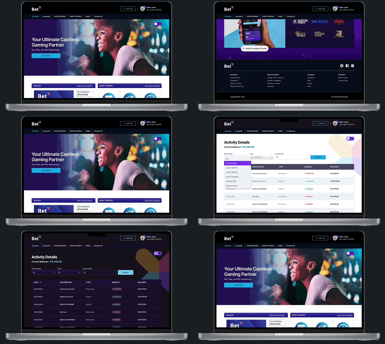
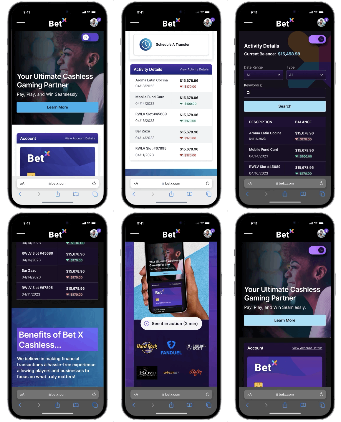
Utilizing the established design system, the transition from concept to high-fidelity mockups was smooth. Drawing on components, colors, and typography, a consistent visual language was maintained across the mockups. This streamlined approach expedited design and upheld a cohesive user experience, reinforcing Bet X's branding and user-centered design philosophy.
By using the design system's responsive components, grids, guidelines, and auto layout the mockups adapted to diverse screens and devices, resulting in a polished and user-friendly interface. According to preliminary research, nearly 65% of users reported they would be accessing the web-portal on their mobile devices hence mobile optimization was key!
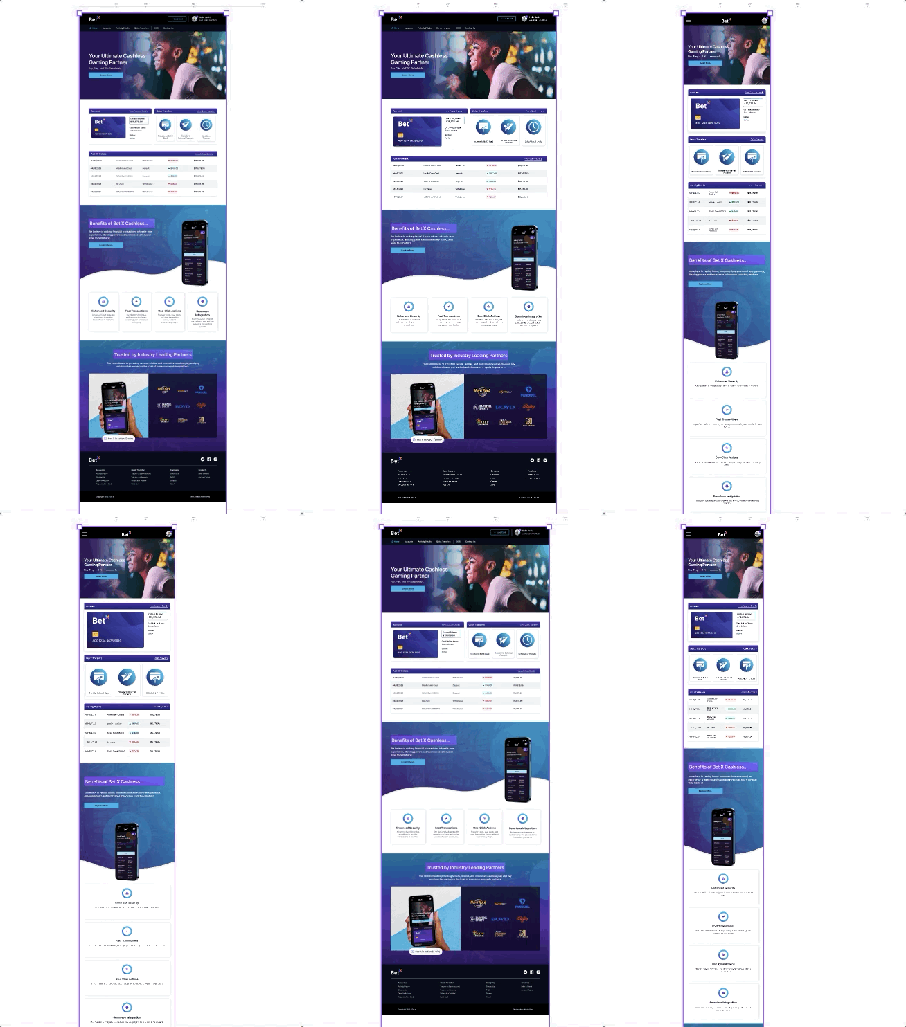
Landing Page
The landing page features essential components, including Account Information, Quick Transfer Options, Activity History, Benefits of Bet X's cashless service, and prominent Industry-leading partners. Elements were strategically organized for effortless user navigation and engagement.
Figma's auto layout played a pivotal role in this process, allowing for dynamic adjustments and maintenance of layout integrity while accommodating various screen sizes.
Fig. 1 : Testing the landing page design’s responsiveness at the designated breakpoints.
Activity History
The Activity History Page boasts essential features such as intuitive filters and a comprehensive transaction history table. This table is structured with crucial categories like date, description, transaction type, amount, and running balance, providing users with a detailed overview of their financial activities.
Fig. 2 : Using Figma’s Breakpoint plugin, the Activity Page was tested for responsiveness.
Dark Mode Integration
Integrating a dark mode option into the design system marked a significant enhancement for Bet X's portal. This addition provides users with a visually comfortable experience, reduces eye strain, conserves battery life, and offers the benefits of reduced glare in low-light environments.
Dark Mode Components & Styles
Introducing dark mode variants to all components in the design system library enhanced its adaptability and user preference customization. A branded dark mode color palette was created, using overlay values of the brand's secondary Purple 500 (#6200EE ) over the recommended dark theme surface color (#121212).
Furthermore, for accessibility assurance, desaturated primary and secondary color accents were incorporated, in adherence with WCAG's legibility standards This approach follows Material Design's Dark Theme best practices.
Outcome
By following a methodical approach, the challenges faced by the Bet X web portal design process were successfully addressed. The newly established design system, responsive components, and dark mode library brought about several positive outcomes.
Consistency
Designers and developers now have a unified reference point, enhancing collaboration and ensuring design consistency across the portal.
Responsive Design
The introduction of responsive components ensures optimal user experiences across various screen sizes and devices.
Dark Mode
The new dark mode color library provides users with an alternative interface that reduces eye strain and enhances usability in low-light conditions.
Efficient Handoff
The streamlined handoff process accelerates development cycles and minimizes discrepancies between design and implementation.
Conclusion & Next Steps
Building the design system and responsive components for the Bet X cashless payment portal, along with the implementation of a dark mode color library, significantly improved the user experience and collaboration between designers and developers.
Next steps involve continued refinement and expansion of the design system, incorporating user feedback and iterative design processes to enhance its usability and effectiveness. Additionally, exploring the integration of Figma's new variables feature, could further optimize the design process, enabling more efficient adjustments and updates to the system. As Bet X continues to evolve, this design system will serve as a foundational framework, facilitating consistent and user-centric design practices for future enhancements and innovations.

